
vue2中封装一个命令式组件

mr-zc 发布于:2022年01月17日 00:59
前言
日常开发中大多数封装的组件都是先import导入组件,在componets中注册组件,最后在template中使用组件。是的,或许你已经重复了无数次这种操作,但你有没有发现在Element UI中的alert、message,这类组件只需要在全局注册,使用时只需要调用this.$alert("xxx")即可,并没有提到上面说的导入、注册、在模板中使用这三部,那么他是怎么做到的呢?下面不妨让我来带你仿造一个类似element UI 的弹窗,以探究其原理
先来看看使用效果
导入使用
//引入zc-ui组件库
import zcui from "./components/zc-ui"
//注册组件
Vue.use(zcui)

//使用
this.$alert({
title:"xxx提示标题", //可选项默认为 “提示”
text:"xxx提示文字", //必要项显示提示内容
icon:"info", //可选 弹窗文字旁的图标
confirmText:"确定",//可选确定按钮显示的文本,默认为 “确定”
})
运行效果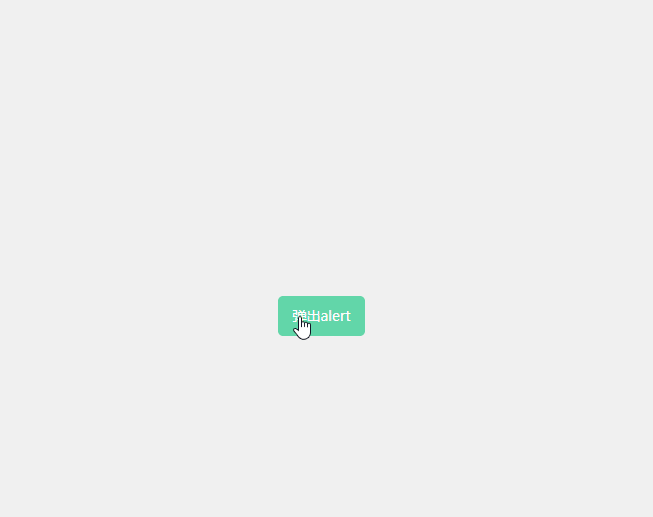
看完上面的效果怎么样?是不是还挺有模有样的,我们来理一下需求和遇到的问题
需求:
1、要能自定义弹窗标题、消息文本,弹窗按钮文本
2、要支持全局的函数式调用,一处引入随从调用
3、弹窗组件要有比较高的权重,覆盖在顶层却不能像普通组件一样受到路由影响
4、弹窗按钮在用户点击后要拿到用户选中的转态,可以通过返回Promise的方式处理
问题:
1、如何实现函数式调用、不在template中使用组件,vue是如何把组件渲染出来的?
2、如何实编写能够通过Vue.use()使用的插件,Vue.use()背后做了什么?
前置知识
1、先来第一个问题如何在template外将组件渲染出来——Vue.extend!
借助Vue.extend我们可以将一个组件模板通过函数调用的方式将其渲染并挂载到指定的dom元素上。在使用时需要接收一个对象或者一个vue的模板作为参数,执行后返回此模板的构造函数。
下面是官方的一个例子,这里将一段模板代码渲染并挂载到了id为mount-point的dom元素上
官方文档例子:https://v2.cn.vuejs.org/v2/api/#Vue-extend
// 创建构造器
var Profile = Vue.extend({
  template: '<p>{{firstName}} {{lastName}} aka {{alias}}</p>',
  data: function () {
    return {
      firstName: 'Walter',
      lastName: 'White',
      alias: 'Heisenberg'
    }
  }
})
// 创建 Profile 实例,并挂载到一个元素上。
new Profile().$mount('#mount-point')
2、第二个问题如何封可以给Vue.use( )使用的插件
Vue.use( )是官方提供给我们用于插件安装的方法,此方法接收一个插件或方法作为参数,当参数为一个函数时函数会直接被执行并把Vue作为实参传入。当传入参数为一个插件时该方法会找到插件下的install方法执行并把Vue作为参数传入,这里画个重点,稍后会用到
官方文档:https://v2.cn.vuejs.org/v2/guide/plugins.html
3、import 导入规则
在import导入文件时如果只写目录名,打包时会自动找到目录下的index.js导入,
如:zc-ui/index.js导入时可以写成import zcuifrom "zc-ui"
开始撸代码
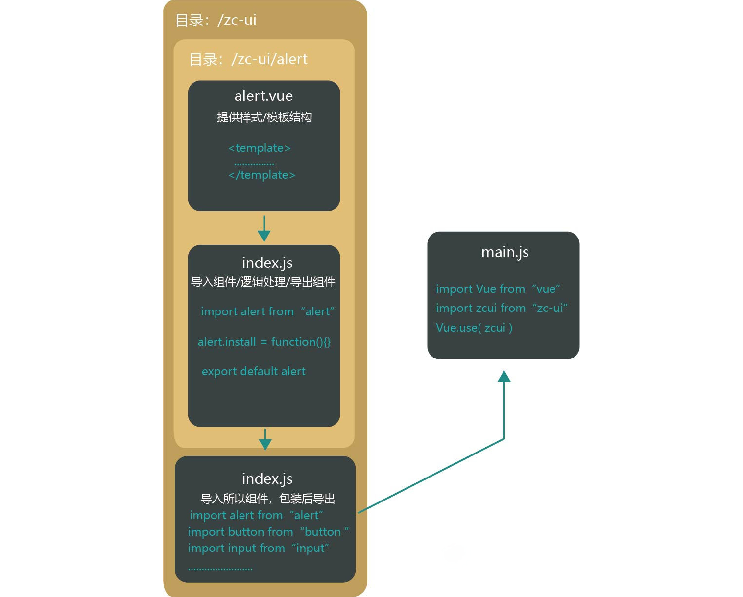
文件结构和流程
代码
alert.vue(样式和结构)
alert.vue
<template>
  <div
    :class="['zc-alert', { backgorundBlur: config.backgorundBlur }]"
    ref="zc_alert"
  >
    <div class="zc-alert-centent">
      <!-- 弹窗标题 -->
      <div class="zc-alert-header">
        {{ config.title || "提示" }}
      </div>
      <!-- 弹窗内容 -->
      <div class="zc-alert-msg">
        <i :class="['iconfont',config.icon]"></i><slot>{{ config.text }}</slot>
      </div>
      <!-- 弹窗按钮 -->
      <div class="zc-alert-btn_box">
        <zc-button v-if="config.type == 'confirm'" class="button" @click="cancel()" >
              {{ config.cancelText || "取消" }}
          </zc-button
        >
        <zc-button class="button" type="primary" @click="confirm()">
            {{ config.confirmText || "确定" }}
        </zc-button>
      </div>
    </div>
  </div>
</template>
<script>
export default {
  name: "zc-alert",
  props: {
    config: {
      required: true,
    }
  }
};
</script>

<style lang="less" scoped>
.zc-alert {
 //组件的相关样式........
}
</style>
zc-ui/alert/index.js(组件的事件逻辑处理,给组件添加install方法,导出)
zc-ui/alert/index.js
import alert from './alert.vue'
alert.install = function (Vue) {

    function create(Component, props) {
        return new Promise((resolve, reject) => {
            //方式一:使用Vue.extend创建
            const Ctor = Vue.extend(Component);
            //创建组件实例
            const alertDom = new Ctor({ propsData: { config: props } })
            //挂载
            alertDom.$mount();
            document.body.appendChild(alertDom.$el);//把元素追加到body后面
            setTimeout(() => {
                alertDom.$el.classList.add("show")
            }, 50)
            alertDom.flag = false
            //监听组件的transitionend事件等动画结束后从dom移除并销毁组件
            function handleTransitionend(e) {
                if (alertDom.flag && e.target.classList.contains('zc-alert')) {
                    document.body.removeChild(alertDom.$el) //移除元素
                    alertDom.$destroy() //销毁
                }
            }
            //监听过度动画
            alertDom.$el.addEventListener("transitionend", handleTransitionend)
            alertDom.$el.addEventListener("webkitTransitionEnd", handleTransitionend)
            //移除弹窗组件
            alertDom.remove = () => {
                alertDom.$el.classList.remove("show");
                alertDom.flag = true
            }
            //取消按钮事件处理
            alertDom.cancel = (res) => {
                reject(res)
                alertDom.remove()
            }
            //确定按钮事件处理
            alertDom.confirm = (res) => {
                resolve(res)
                alertDom.remove()
            }
        })
    }
    Vue.prototype.$alert = (obj) => {
        return create(alert, obj)
    }
    Vue.prototype.$confirm = (obj) => {
        return create(alert, { type: 'confirm', ...obj })
    }
};

export default alert
zc-ui/index.js(导入所有组件内,打包导出)
zc-ui/index.js
import alert from './alert'
import button from './button'
//......

const components = [
    alert,
    button,
    //......
]

const install = function (Vue) {
    components.forEach((item)=>{
        Vue.use(item)
    })
}

export default {install}
总结
在其他vue的组件库中其实实现方法都大致雷同,核心都是封装组件模板样式结构,并预留“坑位”,使用时引入并通过Vue.use()把组件注册到全局,使用时用数据把“坑”填上渲染,部分如alert、toast等组件通常会挂载到Vue原型上,使用时通过this.$xxx调用